Business Writing
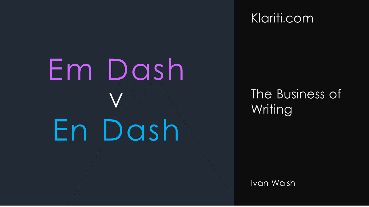
Em Dash v En Dash

Sep
Noreen Malone, senior editor at New York magazine, admits what everyone else thinks about those pesky em-dashes.
“The problem with the dash—as you may have noticed!—is that it discourages truly efficient writing. It also—and this might be its worst sin—disrupts the flow of a sentence. Don’t you find it annoying—and you can tell me if you do, I won’t be hurt—when a writer inserts a thought into the midst of another one that’s not yet complete?”
What is an Em Dash?
The em dash (—), based on the width of an uppercase M, is used primarily to set off sentence elements.
Style guides get very upset if you use word spacing on either side of an em dash—so don’t!
When to use an em dash?
According to the Microsoft Manual of Style:
To set off a phrase that deserves more emphasis.
Use one em dash on each side of the phrase.
Correct
The information in your spreadsheet—numbers, formulas, and text—is stored in cells.
To set off a phrase or clause at the end of a sentence for emphasis. Use one em dash.
Correct
Set key names in all caps—for example, CTRL or ALT.
When not to use an em dash
It warns against using an em dash to do the following:
- Instead of a bullet to set off items in a list.
- To indicate an empty cell in a table.
- When an independent clause follows an em dash, do not capitalize the first word unless it is a proper noun.
HTML Code for em dash
The HTML code for an em dash is —.
According to The Punctuation Guide, “The em dash is perhaps the most versatile punctuation mark. Depending on the context, the em dash can take the place of commas, parentheses, or colons—in each case to slightly different effect.
Notwithstanding its versatility, the em dash is best limited to two appearances per sentence. Otherwise, confusion rather than clarity is likely to result.”
The editor adds that, “A pair of em dashes can be used in place of commas to enhance readability. Note, however, that dashes are always more emphatic than commas.”
Em dash Typography
Grammarist explains that “Publications make varying style choices when it comes to rendering the em dash.”
- Some use the equivalent of three linked hyphens surrounded by a space on each side (like — this), and some omit the surrounding spaces (like—this).
- The online New York Times and most non-U.S. publishers, use an en dash (or the equivalent of two hyphens) surrounded by spaces (like — this).
- The BBC online, use a hyphen surrounded by spaces (like – this).
It adds that “The hyphen is traditionally regarded as a poor substitute for the dash, but given the relative ease of typing the hyphen, its use in lieu of the dash seems to be on the rise, and many see nothing wrong in it.”
How to type an em dash
So, how do you type one?
In Mac OS X— hold down the option and shift keys and typing a hyphen.
In Microsoft Word — hold Ctrl + Alt + – (minus). That’s the key above the + sign on your keyboard.
Note: this is only available using the hyphen on the numeric keypad not the main keyboard.
Word automatically renders an em dash if when two hyphens are typed, unspaced, between words.
Ilene Strizver, founder of The Type Studio, warns: never use two hyphens in place of an em- or en-dash. This typographically incorrect practice is a holdover from typewriter days, when there were no dashes on the keyboard at all, just hyphens. Now there’s no excuse for this very un-dashing and unprofessional habit.
Strunk and White caution against overusing the em dash: “Use a dash only when a more common mark of punctuation seems inadequate.”
The last word goes to Noreen Malone.
But if you want to make your point—directly, with clarity, and memorably—I have some advice you’d do well to consider. Leave the damn em dash alone.
You agree?
Does the em dash annoy you?
